InTDS ArchivebyMel Richey, PhDEntity-Resolved Knowledge GraphsNew words. Old concepts. In the end, it’s about data fusion.Jun 21, 20243Jun 21, 20243
InTDS ArchivebyChristopher TaoMake Your Python Data Visualisation Charts Well-”Rounded”Basic usage of the library PyCirclize — Circos DiagramsMar 10, 20242Mar 10, 20242
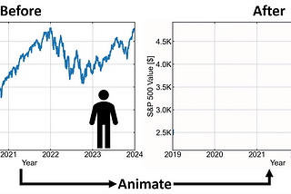
InTDS ArchivebyFouad FarajLive Graphs with FFmpeg to Enhance your Data StorytellingAnimate your Data Visualizations with this FFmpeg TutorialApr 15, 20242Apr 15, 20242
InThe StartupbyDr. Soumen Atta, Ph.D.A Tutorial on NetworkX: Network Analysis in Python (Part-I)In this tutorial, we will learn about the NetworkX package of Python. NetworkX stands for network analysis in Python. It is mainly used…Jan 31, 20212Jan 31, 20212
InTDS ArchivebyBoriharn KBeyond the Cloud: 4 Visualizations with Python to use instead of Word CloudCreating 4 Visualizations with Python that can provide more information than Word CloudJul 20, 20222Jul 20, 20222
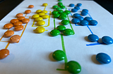
InTDS ArchivebyErin WilsonDo European M&Ms Actually Taste Better than American M&Ms?An overly-enthusiastic application of science and data visualization to a question we’ve all been askingJan 23, 20247Jan 23, 20247
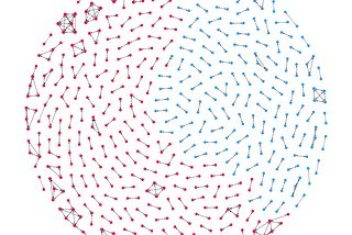
Milan JanosovA Network Map of The WitcherCreating the social map of the Witcher by analyzing the fantasy series’ book corpus.Jan 17, 20243Jan 17, 20243
InTDS ArchivebyThomas Hikaru ClarkNew to Data Visualization? Start with New York CityHow I used New York’s wealth of publicly available data along with Plotly and Pandas to develop my data visualization skillsApr 16, 20204Apr 16, 20204
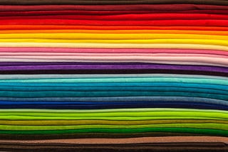
InTDS ArchivebyLee VaughanCustomize Colormaps with MatplotlibMatch your colors to your themeDec 6, 20235Dec 6, 20235
InTDS ArchivebyAndy McDonaldUsing Plotly 3D Surface Plots to Visualise Geological SurfacesVisualising the Subsurface using Python Data Visualisation LibrariesJun 21, 20233Jun 21, 20233
InTowards AIbyBex T.10 Advanced Matplotlib Concepts You Must Know To Create Killer VisualsBecome Leonardo da MatplotlibJun 30, 20239Jun 30, 20239
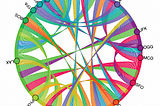
InTDS ArchivebyWei-Meng LeePlotting Chord Diagrams in PythonHow to use Holoviews to plot chord diagrams to show relationships between various data attributesFeb 15, 20232Feb 15, 20232
InTDS ArchivebyAndy McDonaldFrom Dull to Stunning: How Matplotx Can Improve Your Matplotlib ChartsSimplifying the process of creating stunning charts with MatplotxApr 3, 20231Apr 3, 20231
MoJoMoonColor Guide to Seaborn PalettesSeaborn arguably has one of the most rich visualization packages for python. It contains beautiful colors with powerful controls of…Apr 19, 202015Apr 19, 202015
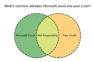
InTDS ArchivebyChaitanya BawejaHow to Design Professional Venn Diagrams in PythonA quick guide for plotting stylish and professional Venn diagrams using matplotlib-vennJul 19, 20201Jul 19, 20201
InTDS ArchivebyThiago CarvalhoVisualizing Intersections and Overlaps with PythonExploring options for one of the hardest tasks in data visualizationDec 16, 20202Dec 16, 20202